
Today’s Plan:
- Infographics
- Homework
Infographics
So far this project has focused on developing graphs and presenting data. I realized today, as I was writing today’s class notes, that I haven’t discussed the ethical presentation of data. Whoops. Let’s cover this quickly by looking at a Business Insider article that highlights what *not* to do.
My sense after Monday’s class is that this isn’t your favorite assignment this semester–and that might be a bit of COVID fatigue, or it might be that the concept of an infographic is a bit murky. I don’t think I’ve clearly articulated the expectations for this project, so let me do that now.
When I taught this course for the first time in 2014, here’s the three infographics I used as examples:
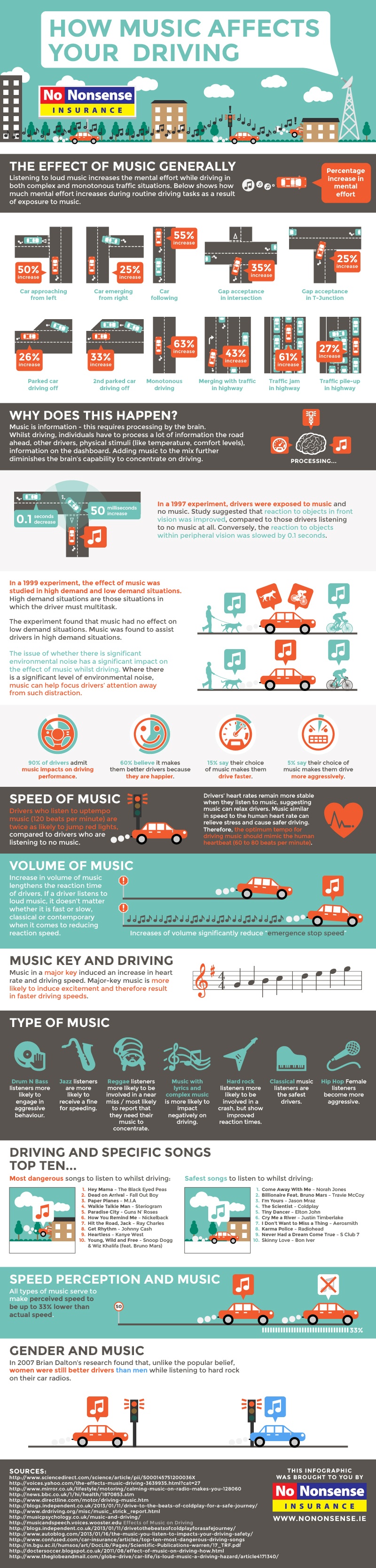
- How Music Affects Your Driving
- Everything You’ll Ever Want to Know About James Bond
- The Death of Motor City
I think they still hold up. Of course, these were “new” and “cool” in 2014, and, if you were moving around social media, you’d bump into a lot of them. Today? I’m not sure I still see them, and am wondering how anachronistic an infographic project actually is. I do think there’s importance in learning how to present data, but am wondering about how, in future classes, I might ask students to present their data.
I say future classes, because y’all are making an infographic. We are going to push through and finish this project so that we can start researching zine layout and learn how to assemble a book/magazine in InDesign.
In hopes of soldiering on, I looked into infographic templates for InDesign. Let’s take a look at what I found. Hmm. Let’s modify that search a bit. Hmm.
So it looks like Illustrator is now the program for developing infographics. Or, if you have less text/content, Photoshop. InDesign has templates for infographic-influenced brochures or presentations. What to do? We are going to ignore this fact and soldier on because I say so. We need a template for designing an infographic.
Infographic Expectations
Content: As I originally indicated, your infographic should have four different visualizations. Each visualization might be composed of one or more graphs. There should be some textual description/analysis of your graphs as well. Technical writing 101: whenever you share a graph or chart, you should concisely explain what a graph or chart says–do not leave it to the reader/viewer to figure this out.
Describing a graph can be tricky. Let’s get some language and templates.
Design: The infographic project reinforces many of the design concepts we’ve learned in previous projects: contrast, repetition, alignment, spacing, typography, and color. Let’s think about how those concepts manifest in an infographic:
Typography
- Sans-serif
- Headings tend to be thick (when thin, they have a tall x-height
- Alternatively, headings can be all caps or small caps
- Font color is rarely black; occasionally, you get gray font on a white background–trick is to make sure fonts have enough contrast that they are readable
- Adequate margins/padding/space between elements?
- Shouldn’t look cluttered
- Symmetrical layout for graphics; designed on a grid; elements repeat
- Generally a 3-5 color palette (sample palettes)
- Strong contrast that creates a focal point
Alignment/Layout/Spacing
Color
Homework
I’m having a bit of a hard time estimating how long it will take you to put a nice looking infographic together. There’s no Adobe CRiaB this week, so I’m going to ask that you have your infographic finished by Monday? [Increase in vocal pitch]
Do we want an infographic draft / revision? [more points, higher stakes] or an infographic done [fewer points and we move on]?
