
Today’s Plan:
- Quick Overview of Visual Rhetoric (with an eye toward web interfaces) (12 minutes)
- Flash View at Presidential Campaign Posters (8 minutes)
- Looking at Presidential Campaign Posters (25 minutes)
- Walkaway (5 minutes)
A Quick Introduction to (Visual) Rhetoric
Today’s class is part of a larger assignment in my Visual Rhetoric course, one in which students make first sincere and then parodic campaign posters for the 2016 presidential election. A major part of the project involves researching the candidate’s campaigns; such research involves familiarizing ourselves not only with their political platforms, but also with the visual/design dimensions of a campaign. Thus, the project introduces visual rhetoric and document design in terms of rhetorical and genre awareness as it teaches the fundamentals of Photoshop and print production. One of the first activities I do to both introduce visual/rhetorical analysis and help them research potential candidates involves looking at campaign websites.
Rhetorical Dimensions of the Campaign
While rhetoric can be a quite difficult term to define, for today’s purposes, thinking about it in terms of visual design, I would define it as anticipating what something *might* mean to an audience, and making changes to clarify, amplify, or adjust how an audience member sees or does something. It is also, as Aristotle argues, the ability of a speaker to recognize and adjust an audience’s conscious or subconscious predisposition toward a person or idea (“to prepare the judge”).
Professor Cornish mentioned that you are working with interfaces and interface theory; I tend to think of interfaces in terms of Kenneth Burke’s theory of language as a “terministic screen.” For Burke, language doesn’t provide us direct access to reality as much as it mediates, shapes, inflects, orients, our perceptions. Language is an interface between raw “real” experience and our cognition of it. He perhaps puts this in simpler terms:
Men seek for vocabularies that are reflections of reality. To this end, they must develop vocabularies that are selections of reality. And any selection of reality must, in certain circumstances, function as a deflection of reality.
I bring this up here because Burke’s approach to language stresses that language is never neutral, and that often times our vocabulary shapes our perception and our communication with an audience. Such awareness of language’s impact on perception and communication requires that we think carefully about our word choice, and learn to hear how others might (mis)interpret our messages. Similarly, when thinking about visual design, print production, and interfaces, we need to attend carefully to design decisions. Like language, interfaces aren’t “neutral” conveyors of information or passageways to experience; they are the result of un/conscious decisions that in turn influence our experience.
With these rhetorical elements in mind, we can ask the following questions of presidential campaign websites:
- What slogans has the campaign developed?
- What exigencies does the campaign need to address (what are their perceived short-comings? What events, reputations, terms, accusations, etc. might haunt them?)
- What traditions does the campaign tap into or draw upon?
- With what demographics does the candidate do well?
- With what demographics does the candidate struggle?
As we look at websites today, we can try to reverse engineer how these questions motivated design choices.
Design Dimensions of the Campaign
Of course design is itself rhetorical, since no artist or designer exists in a vacuum. We are often influenced by the trends and traditions around us, and visuals are no exception. For instance, a quick look through past campaign posters reveals both how presidential posters reflect the design traditions of their era and how quickly these “traditions” can change.
When I talk about visual/design dimensions, I am referring to some pretty well-established categories:
- Layout
- Rule of Thirds
- Magic Square
- Lines and Pathways
- Note about images and eyes
- Focal Point (lines, color, contrast)
- Color
- Symbolic Value (Culture, History, Nature)
- Hue and Saturation
- Typography
- Font Choice/Change
- Font Size and Weight (Change)
- Font Color (Change)
- Interface
- Navigation Menu
- Mobile Optimization View
- Translation Options
- Accessibility
- Does the homepage address policy? (Rhetorical)
- Does the homepage contain any copy? (Is there a block of text/content?)
- Contemporary Web Design
Flash View of the Campaign Websites
I’ll put each website up for about 15 seconds and ask everyone to write down 2 rhetorical or design elements that catch their attention.
- Donald Trump
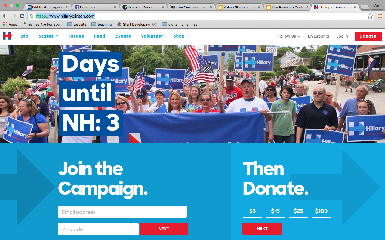
- Hillary Clinton (back up image)
- Jeb Bush
- Bernie Sanders
- Marco Rubio
- Ben Carson
- Rand Paul
- Jill Stein
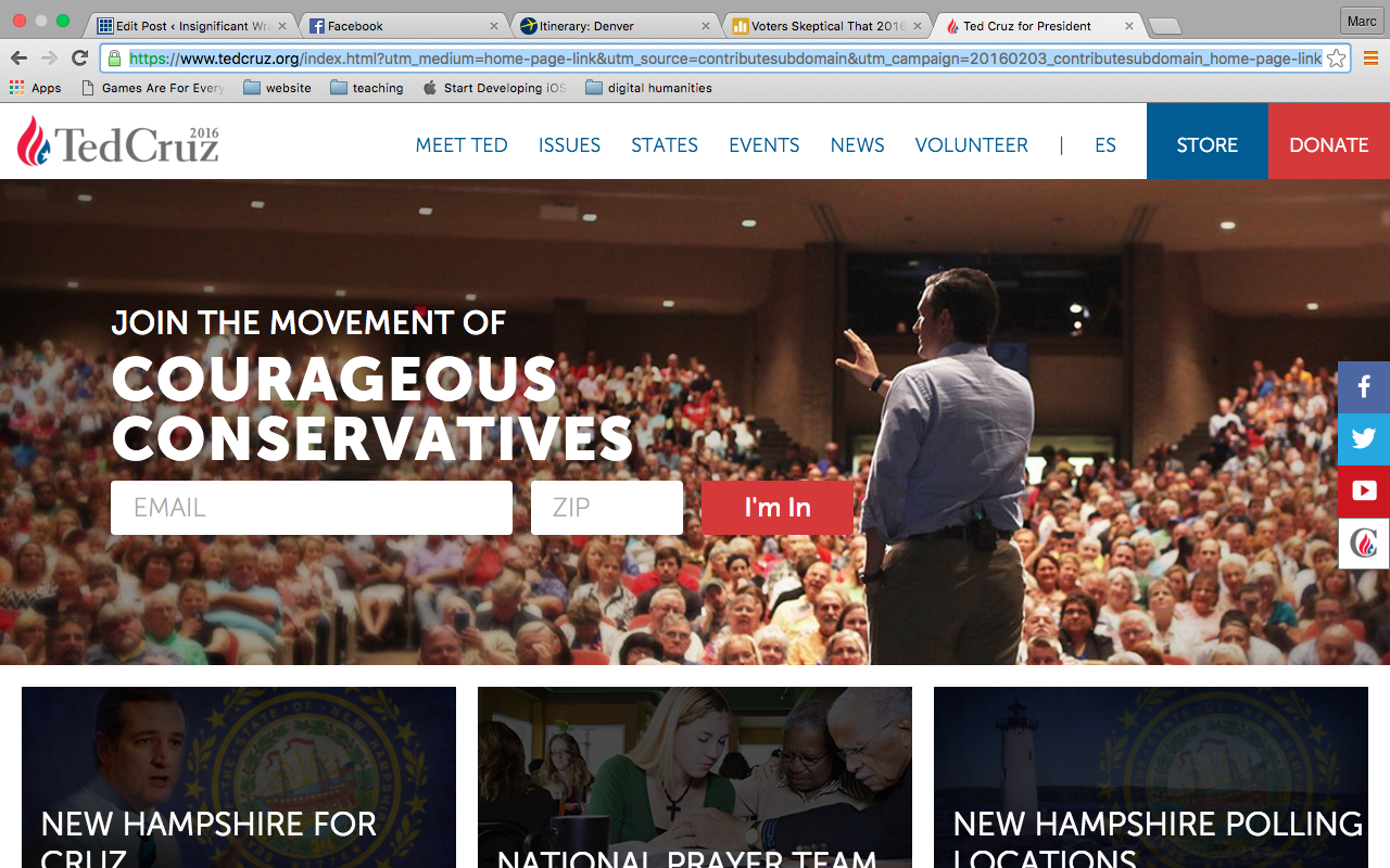
- Ted Cruz (note redirect) (backup image)
Walk Away
As I said at the start of class, my students used these websites as preliminary research for developing presidential campaign posters:
Inspired by Gries' Still Life, Presidential Campaign Posters. Remixes to come next week. #enc4218 pic.twitter.com/G7Lq9xoDxb
— marccsantos (@Oisin16) February 5, 2016
I like to end discussion classes with a reflection, so I’ll borrow my friends’ idea and ask you to write a walk-away from today’s class on the index cards I distributed. What it one or two rhetorical or design principle(s) that you are likely to remember?
