
Today’s plan:
- Discuss Readings
- Review Paper Assignment / Questions
- Homework
Today’s plan:
Let’s take some time to talk about your projects.
There is one final component to Project One, and that is that I would like you to design a “remix” of one of your classmates Presidential Posters. The inspiration for this project is Gries chapter 8, “Obama Hope, Parody, and Satire,” specifically the sections “A Popular Parody or Meme” and “Obamacon” (pages 220-239, you should read these to help generate a strategy for your remix). As Gries illustrates, not every remix of Obama Hope was intended as critical satire–the popularity of the image created imitations that had nothing to do with politics. As you sketch and plan your parody, you should feel free to be inventive and have fun. And remember that we will be sharing these parody posters in class next week.
Once I have all the .psd files uploaded to Canvas, I will upload them to the files section. I will get these up by tomorrow. Note: as of 10:29, I only have 5!
The only requirement for the remix is that you begin with another person’s .psd file, and that, when we look at the final, we can determine which file you chose.
Deliverable: You will bring a full-color printed copy of this poster to class next week. There is no need to submit a digital copy.
Today’s Plan:
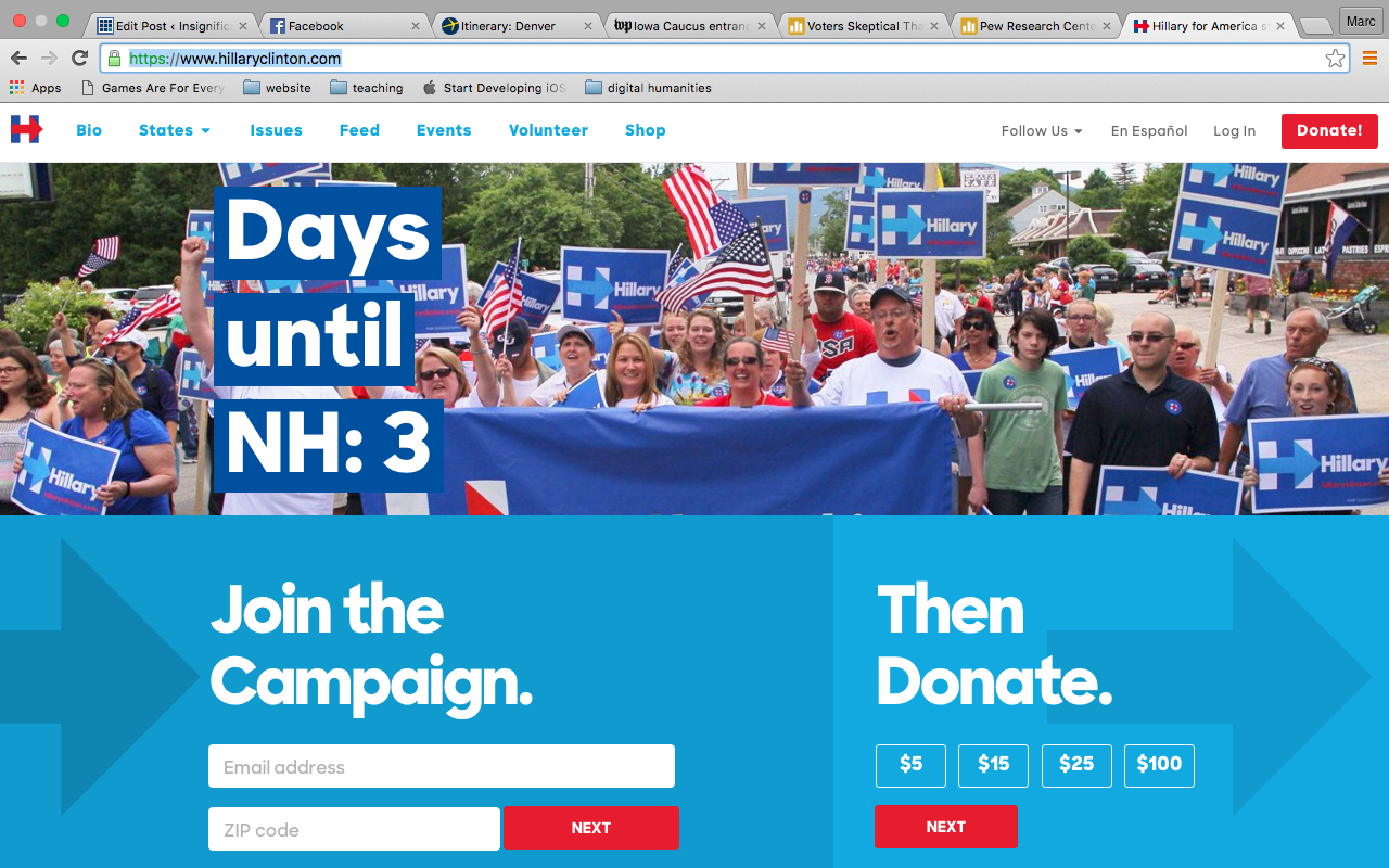
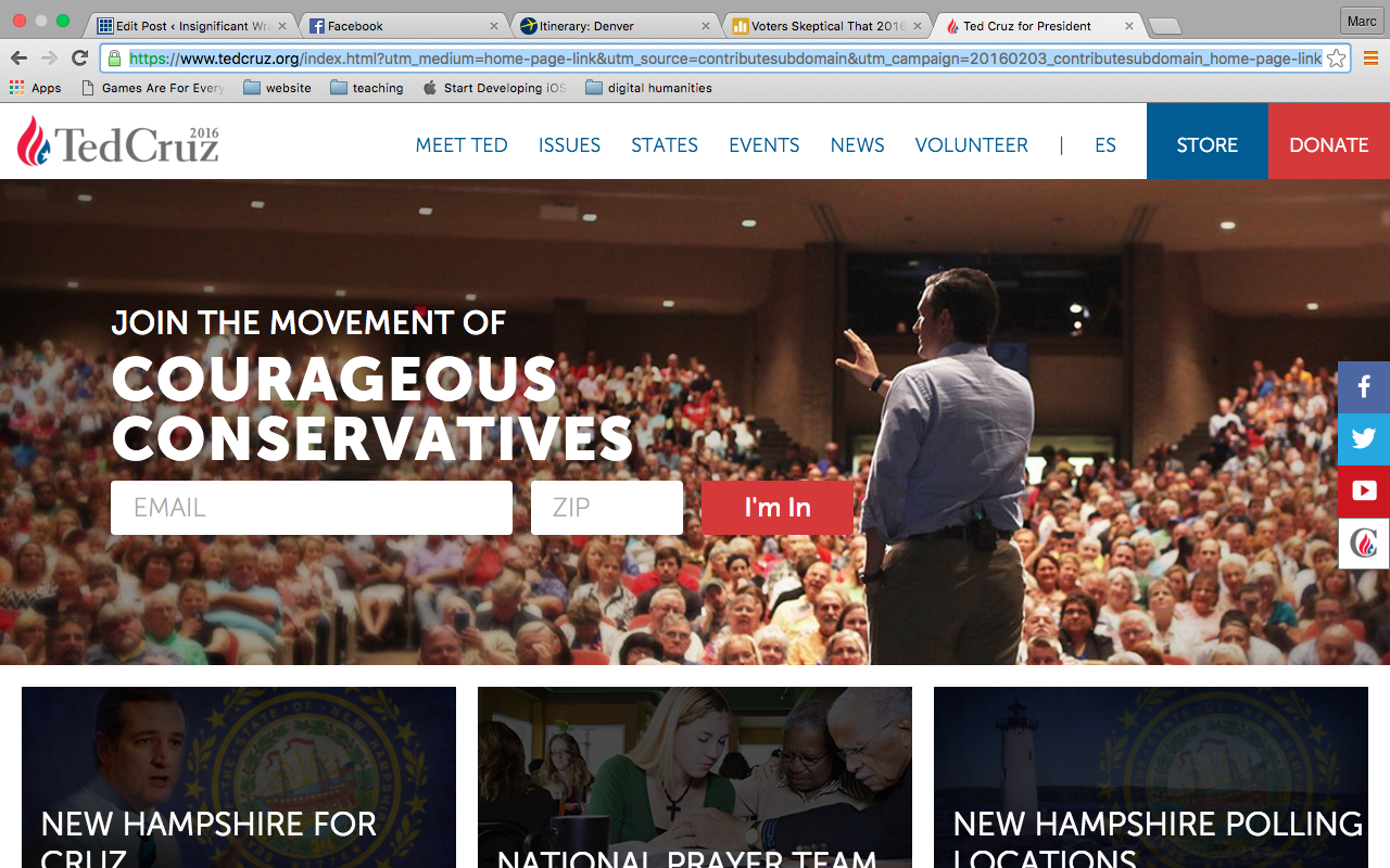
Today’s class is part of a larger assignment in my Visual Rhetoric course, one in which students make first sincere and then parodic campaign posters for the 2016 presidential election. A major part of the project involves researching the candidate’s campaigns; such research involves familiarizing ourselves not only with their political platforms, but also with the visual/design dimensions of a campaign. Thus, the project introduces visual rhetoric and document design in terms of rhetorical and genre awareness as it teaches the fundamentals of Photoshop and print production. One of the first activities I do to both introduce visual/rhetorical analysis and help them research potential candidates involves looking at campaign websites.
While rhetoric can be a quite difficult term to define, for today’s purposes, thinking about it in terms of visual design, I would define it as anticipating what something *might* mean to an audience, and making changes to clarify, amplify, or adjust how an audience member sees or does something. It is also, as Aristotle argues, the ability of a speaker to recognize and adjust an audience’s conscious or subconscious predisposition toward a person or idea (“to prepare the judge”).
Professor Cornish mentioned that you are working with interfaces and interface theory; I tend to think of interfaces in terms of Kenneth Burke’s theory of language as a “terministic screen.” For Burke, language doesn’t provide us direct access to reality as much as it mediates, shapes, inflects, orients, our perceptions. Language is an interface between raw “real” experience and our cognition of it. He perhaps puts this in simpler terms:
Men seek for vocabularies that are reflections of reality. To this end, they must develop vocabularies that are selections of reality. And any selection of reality must, in certain circumstances, function as a deflection of reality.
I bring this up here because Burke’s approach to language stresses that language is never neutral, and that often times our vocabulary shapes our perception and our communication with an audience. Such awareness of language’s impact on perception and communication requires that we think carefully about our word choice, and learn to hear how others might (mis)interpret our messages. Similarly, when thinking about visual design, print production, and interfaces, we need to attend carefully to design decisions. Like language, interfaces aren’t “neutral” conveyors of information or passageways to experience; they are the result of un/conscious decisions that in turn influence our experience.
With these rhetorical elements in mind, we can ask the following questions of presidential campaign websites:
As we look at websites today, we can try to reverse engineer how these questions motivated design choices.
Of course design is itself rhetorical, since no artist or designer exists in a vacuum. We are often influenced by the trends and traditions around us, and visuals are no exception. For instance, a quick look through past campaign posters reveals both how presidential posters reflect the design traditions of their era and how quickly these “traditions” can change.
When I talk about visual/design dimensions, I am referring to some pretty well-established categories:
I’ll put each website up for about 15 seconds and ask everyone to write down 2 rhetorical or design elements that catch their attention.
As I said at the start of class, my students used these websites as preliminary research for developing presidential campaign posters:
Inspired by Gries' Still Life, Presidential Campaign Posters. Remixes to come next week. #enc4218 pic.twitter.com/G7Lq9xoDxb
— marccsantos (@Oisin16) February 5, 2016
I like to end discussion classes with a reflection, so I’ll borrow my friends’ idea and ask you to write a walk-away from today’s class on the index cards I distributed. What it one or two rhetorical or design principle(s) that you are likely to remember?
Today’s Plan:
To get things started today, I am going to ask you to form groups of three. Each group will be assigned a question to research. Here’s the questions:
I’ll give your groups 15 minutes to come up with a response to these questions. I’ll ask you to read a response that brings our attention to at least two places / passages in the text.
We’ll open discussion with your responses to the questions above; I also want to highlight a few passages and share my notes.
There’s two readings for homework. The first is from Paulo Freire (.pdf uploaded to files). The second reading is from Audre Lorde and is available online via this link.
I would also ask you to think about your upcoming essay assignment (detailed in the last post). Here’s a quick guide to our readings this semester:
Of course, we will add to this list Freire, and Lorde. Remember for your papers that I want you to address (in some fashion, to greater and lesser extents) 4 educators as you build your own theory of education, thinking both about the ENDS of education, as well as the MEANS.
Today’s plan:
Today’s Plan:
I have created a discussion thread in Canvas called “Project 2 Rubric.” I want you to contribute 5 things that you think I should take into account as I grade projects. I have already indicated two of these things above: that the project have some kind of specific visual inspiration (a specific image upon which you modeled some design decisions, bonus points if you can also talk about a visual genre, style, or trend). Second, your design should be informed by research on the candidate and their campaign (and, as I indicate below, your reflection paper should cite specific sources and include hypertext links).
But now I want you to think of other elements of visual design and production that you have read in Gries, in White Space, or that we have covered in class (or that you have covered in another class). If you are clueless, then you might scan this article on 50 core design terms and principles.
You will notice that project one is accompanied by a reflection document. This document is 1/4 of the project grade and 5% of your course grade. The purpose of this document is to demonstrate your ability to talk about your design choices in a concise, coherent, and meaningful way, using language common to designers. Our previous exercise should have helped tease some of this language out. Furthermore, knowing this language should help inform your design and make for a better poster.
What you shouldn’t do is make your visual and then try to apply the language to what you already did. This is called bullshitting. I will know if you are doing this. I will not be happy about it. Remember that all composition–whether written or visual–requires revision. Even if you have started working on a draft of your poster, you should recognize that today’s work might require you to (re)think (or, in some cases, restart) what you are working on.
Another reason I require these documents is that I understand many of you are new to the technology. I don’t want your grade to be solely based on your ability to use the technology (though it is in part based on that–as professional and technical writers you will be expected to learn and use new technologies and interfaces all the time). I want your grade to also include your ability to talk about design in a meaningful, rhetorical way (here rhetoric means anticipating what something *might* mean to an audience, and making changes to clarify, amplify, or adjust how an audience member sees or does something).
I’m sure we will tease out a bunch of criteria for what goes in this paper above–you should certainly consult the rubric as a way of brainstorming the paper! And brainstorming your poster design! I want to highlight a few other things. Open the paper with some kind of description of the poster, start with the more philosophical and inspirational stuff. What candidate did you choose? What research did you do? What do you perceive as the biggest challenge that candidate faces? What is their strength? How does your poster reach out to people who might *not* want to vote for them or address critiques from other candidates? Note that this section can and should include hyperlinks to articles. Note that hyperlinks are not copy and pasted URL’s, as this tutorial on Microsoft Office’s help page details. Note that it is really nice when a hyperlink includes some mention of where that link is taking me.
The paper should also identify the design style, image, trend, etc that influenced your design. What was this trying to look like? Again, links to specific sites are helpful.
There’s the more nuts-and-bolts design principles that we explored in today’s class. Make sure you account for those. For instance, how might you select your font(s)? Let’s look at how to check the source code for either “.css” or “font” (depending on whether the site uses internal or external css, or uses a Google font).
For the research, I asked you to work from both the Gries research and our examination of campaign websites in class. I want to go around the room and have everyone share three things:
If you can’t answer all of these questions, then you will need to rethink and revise your design before you turn in your final poster.
Ok, here we go:
Note that Kelsey found out that the USF print shop offers color printing for significantly cheaper! The print shop is located in the Marshall center and I have emailed out a .pdf with prices and file formats.
Obviously, the homework is to finish this first part of Project One. Also, however, I would like you to read chapter 7 of White Space so you have a bit more design language and considerations to inform your project and your paper.
Today’s plan:
Today’s plan